Still Mink
Member
1,163 posts
2,853
Seen 15th August 2023
25th January 2020, 10:47 AM
When it comes to space exploration what's one thing everyone loves to talk about?
Colonization!
I decided to go on a project of making mars versions of country/state flags. Flags they could maybe use for colonization of the red planet.
Here are two concepts I have come up with, for those unenlightened, here is the current California State Flag.
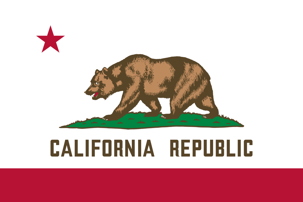
Now here are the mars versions.
Desolate Space

In this rendition, the bear is simplified and standing atop the red planet, with the background representing the darkness of space and the two circles representing the two moons of Mars.
White Space

In this rendition, the bear is simplified and standing atop the red planet, with the background representing the current white background to stay true to the original and the two circles representing the two moons of Mars.
Colonization!
I decided to go on a project of making mars versions of country/state flags. Flags they could maybe use for colonization of the red planet.
Here are two concepts I have come up with, for those unenlightened, here is the current California State Flag.

Now here are the mars versions.
Desolate Space

In this rendition, the bear is simplified and standing atop the red planet, with the background representing the darkness of space and the two circles representing the two moons of Mars.
White Space

In this rendition, the bear is simplified and standing atop the red planet, with the background representing the current white background to stay true to the original and the two circles representing the two moons of Mars.

graphic designer
Moderator


3,098 posts
10,318
Seen 30th August 2023
25th January 2020, 11:54 AM
Love it. California's flag is very detailed, especially the bear. The simplification of the bear on your flags is a nice touch! This is something you would aim for while making a logo, the more simplistic the better. It hints on the gestalt theory, where our eyes are able to fill in missing information.
I think as of which one I like better, I would go with the white because the bear stands out much better against a white background and it keeps the color scheme of the original. But I do like the space feel of the black one.
I think as of which one I like better, I would go with the white because the bear stands out much better against a white background and it keeps the color scheme of the original. But I do like the space feel of the black one.
















 CrimeSolvers











 Kacket