29th January 2019
36 views
36 views
French American Flag Redesign
Still Mink
Member
1,163 posts
2,853
Seen 15th August 2023
29th January 2019, 01:35 PM
Yesterday I found there was an official French American Flag. This flag was used in 1992 to represent French Americans and French History in the New England region, primarily in the states of Connecticut, New Hampshire, Maine, and Vermont.
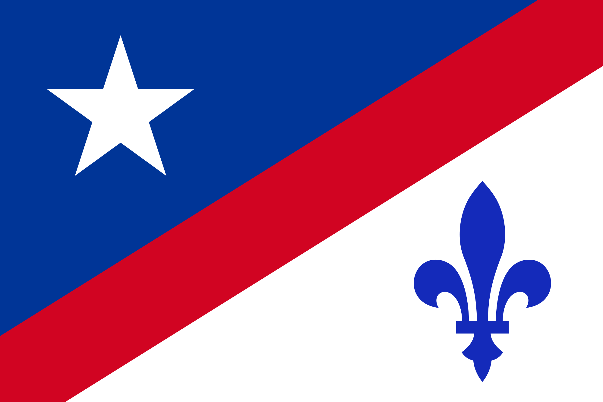
I've decided to make a redesign of it, in 4 different variants.
1st Variant:

Wave
3 stripes to represent the stripes on the US flag, and also the 3 estates (social classes) of France pre-revolution. The colors are both colors of the US flag and the
French Tri-Color. Above the stripes are the 13 stars representing the 13 colonies. In the center of the stars is a French-Canadian Fleur De Lis.
Variant 2:

Wave
Same meaning but different style. Although it removes the "3 estates" meaning to it, I think it looks cooler.
Variant 3:

Wave
Similar to Variant 1, only the stars and fleur de lis lie in the left corner to represent where they go on the Canton of the OG US Flag.
Variant 4:

Wave
Similar to Variant 1 and 3, this time the stripes are in the middle moving diagonal. This is just a different style, the meaning stays the same.
Constructive Criticism is much appreciated! Any recommendations for flags are appreciated as well.
Edit: Added the flags waving underneath

I've decided to make a redesign of it, in 4 different variants.
1st Variant:

Wave
3 stripes to represent the stripes on the US flag, and also the 3 estates (social classes) of France pre-revolution. The colors are both colors of the US flag and the
French Tri-Color. Above the stripes are the 13 stars representing the 13 colonies. In the center of the stars is a French-Canadian Fleur De Lis.
Variant 2:

Wave
Same meaning but different style. Although it removes the "3 estates" meaning to it, I think it looks cooler.
Variant 3:

Wave
Similar to Variant 1, only the stars and fleur de lis lie in the left corner to represent where they go on the Canton of the OG US Flag.
Variant 4:

Wave
Similar to Variant 1 and 3, this time the stripes are in the middle moving diagonal. This is just a different style, the meaning stays the same.
Constructive Criticism is much appreciated! Any recommendations for flags are appreciated as well.
Edit: Added the flags waving underneath

Member
806 posts
1,007
Seen 5th November 2020
29th January 2019, 01:45 PM
Damn Mike, these are some nice flags gg









 CrimeSolvers








 Imperials








 Ren
Ren 




 Drake
Drake 


